We’re always excited when a project that requires split fountain screen printing comes our way. It’s not everyday we get to work with that style of printing. It takes a level of understanding of the print making process that a lot of people have no experience with. Hopefully, after reading this, you’ll have a better understanding of what is possible with this technique.
Split fountain: the basics
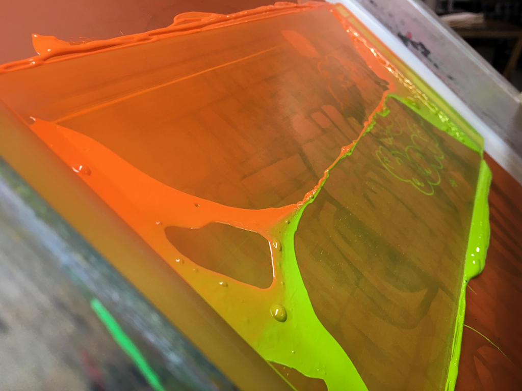
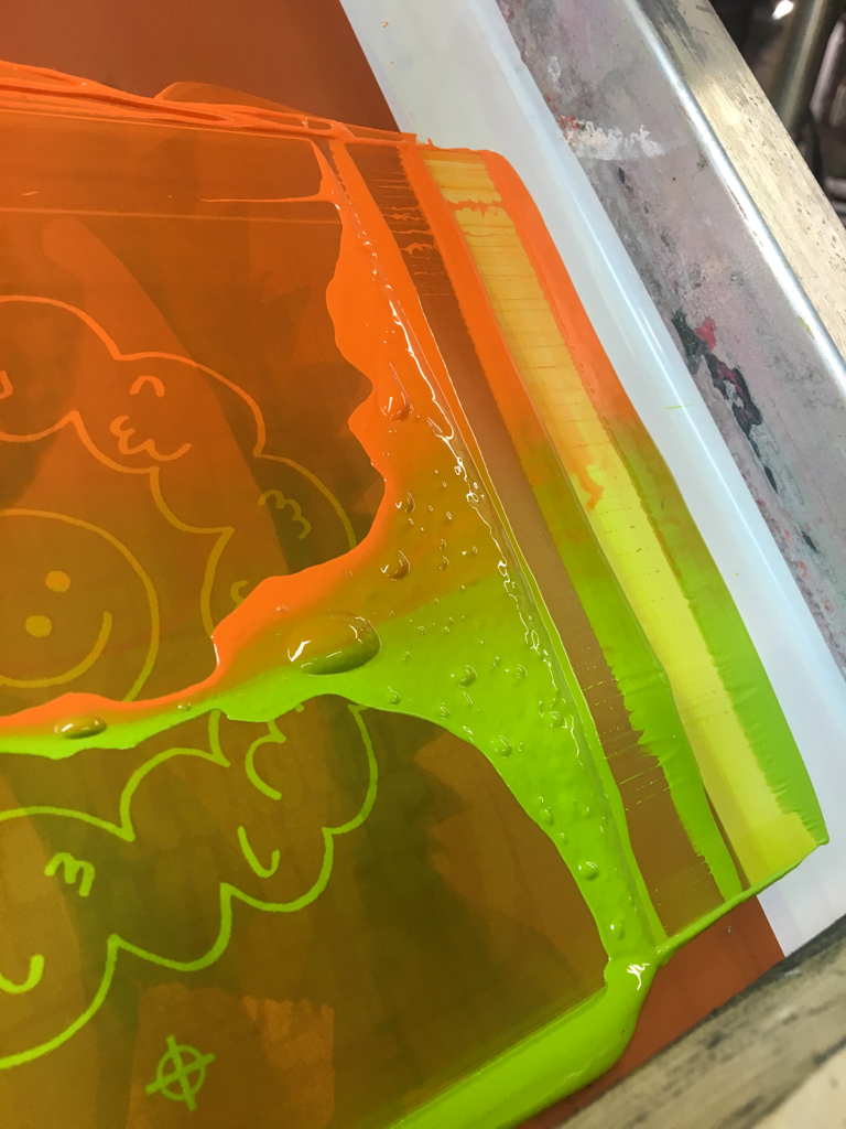
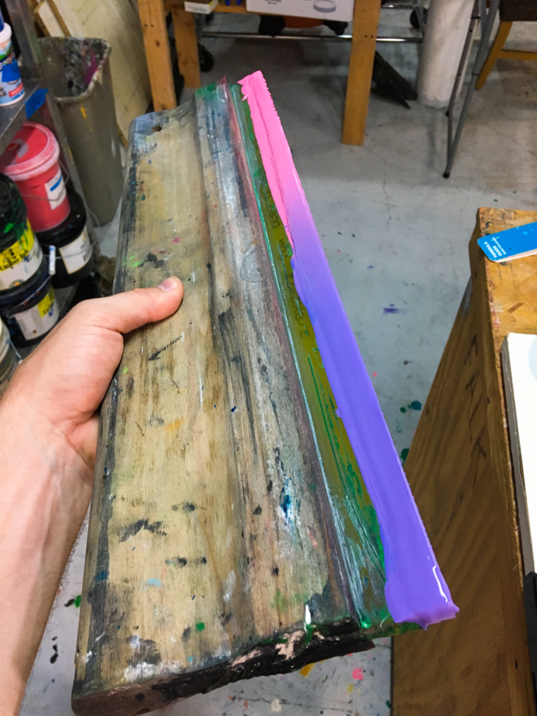
As a rule of thumb in screen printing, every color in your print is a separate screen. When we’re creating a split fountain print, multiple ink colors are placed within one screen and pulled over the graphic. The first prints will have a hard line of each area of ink in screen. As more prints are made, the inks become more blended, resulting in a natural gradient of color. The prints that are created with this technique will all have a slightly unique look to them. With each print, the ink continues to mix and move throughout the frame as the squeegee passes over it.
To help visualize those differences, we’ve created a video of a recent split fountain screen printing project. The project called for blue and pink inks mixed over a snowflake graphic. We always discuss what the client wants in terms of locations of “clean” inks and where they want the blend to fall. For this project, the mixed colors were to appear in the center portion. At the end of the video, you can see all the variations that resulted from printing through production.
Split fountain screen printing on t-shirts
We’ve used this technique on a number t-shirt screen printing projects. We’re not always so great at taking photos projects we print, unfortunately. But we do have a nice sample set that we can show.
The first is this set of tees we created for the Zone 3 space on Western Avenue by the artist Morgan Elliott. We used orange and green inks to create this pocket print. The blended gradient was super cool on these.

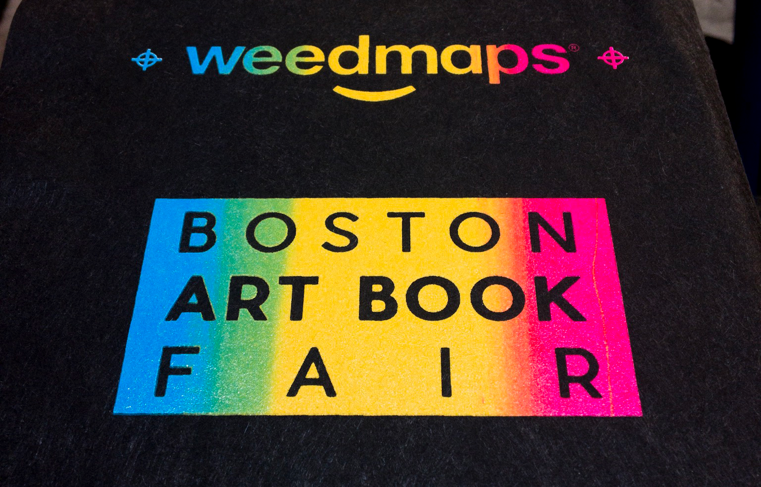
Next up is a set of split fountain prints that started with three base colors. You have to be careful with how much ink you lay down for the middle color. It can span out and push the rest of the ink outside of the image. If you can manage that from the beginning of your production you’ll be in a good place. We have three different projects to show here: one that was a flag background, one that colored a logo, and my favorite split fountain, the blue-yellow-pink blend we did for Weedmaps x Boston art book fair.

Split fountain poster printing
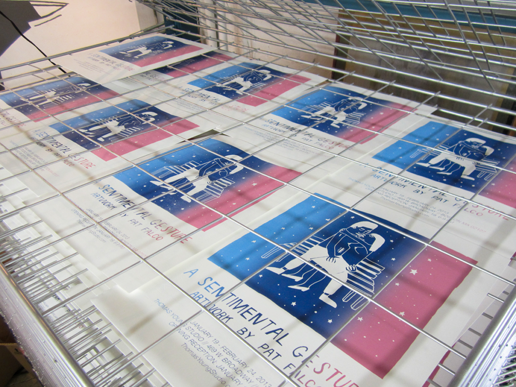
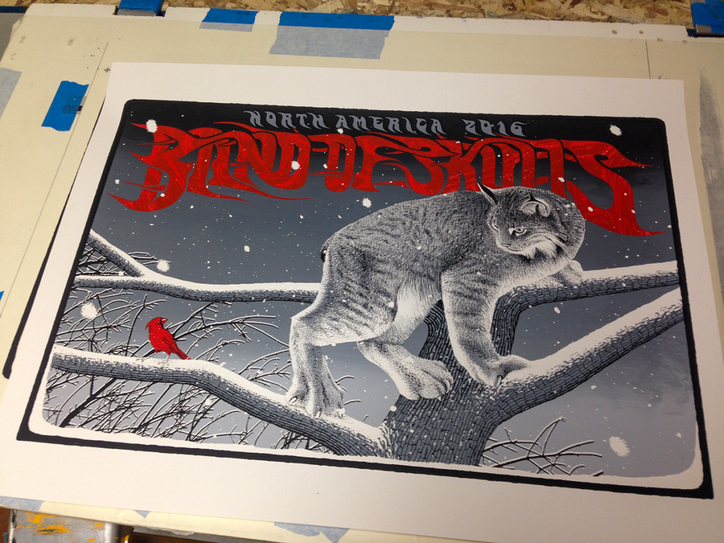
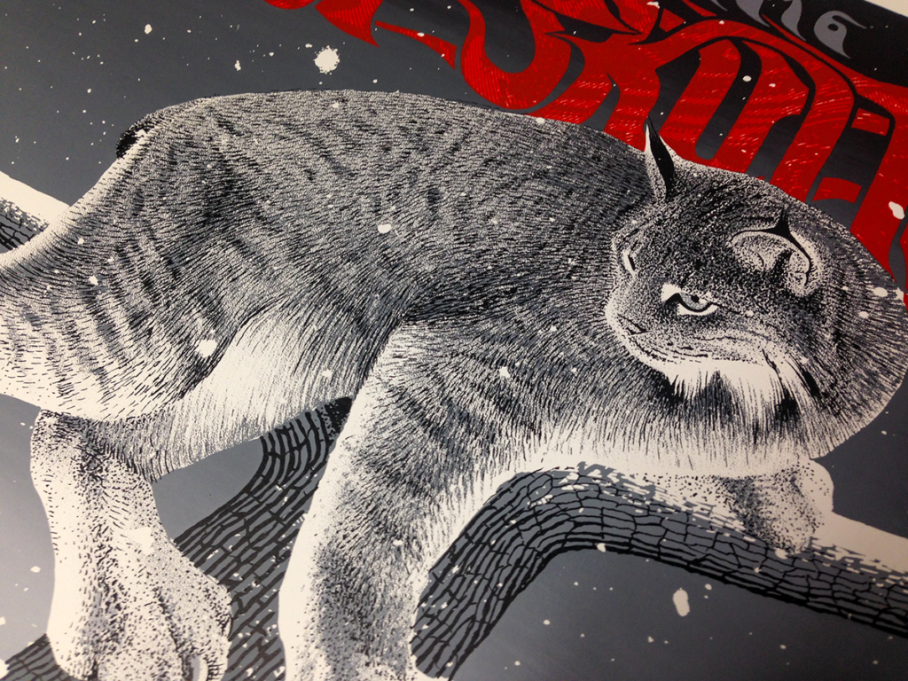
We’ve also done a bunch of poster printing using a split fountain technique. Here are some posters that used a split fountain exclusively for the background. The first image is by our friend Pat Falco and he used the background gradient to lockup his linework. The 2nd & 3rd images are from a set of posters we did for Band of Skulls that had this massive gradient from dark to light grey. We spent a lot of time managing the ink inside the screen on that run but the results were so very worth it.
Last year, we created a set of posters for our friend Craig Ryans. They featured the pointillism style drawings that we pulled these massive split fountains over. We’re really happy with the way these came out, shoot over to his shop to support.

If you’re looking to add a split fountain technique to your next print project, feel free to reach out to us.